Data Exploration
This page was created from a Jupyter notebook. The original notebook can be found here. It explores some of the data contained in or derived from the database. First we must import the necessary installed modules.
import sqlite3
import numpy as np
import pandas as pd
import matplotlib.pyplot as plt
import seaborn as sns
from scipy.stats import norm
Next we need to import a few local modules to calculate some advanced stats not stored in the database and format plots.
import os
import sys

module_path = os.path.abspath(os.path.join('..'))

if module_path not in sys.path:
    sys.path.append(module_path)

from databall.database import Database
from databall.plotting import format_538, kde
from databall.util import print_df
The command below applies a plot style that is influenced by the beautiful graphs found on FiveThirtyEight. I also wrote a function to further customize my plots to more closely mimic FiveThirtyEight graphs using this DataQuest article as a guide.
plt.style.use('fivethirtyeight')
We then need to connect to the database generated during the stat collection process.
conn = sqlite3.connect('../data/nba.db')
The SQL query below calculates the home team’s winning percentage straight up and against the spread since the 1990-91 season and groups the results by season. Specifically, it sums up all occurrences of ‘W’ in the HOME_WL and HOME_SPREAD_WL columns and divides by the total number of games in each season. It also calculates the percentage of games that hit the over and a few other average stats that are plotted later.
data = pd.read_sql('''
    SELECT
        SEASON,
        100.0 * SUM(CASE WHEN HOME_WL = 'W' THEN 1 ELSE 0 END) / COUNT(HOME_WL) AS HomeWinPct,
        100.0 * SUM(CASE WHEN HOME_SPREAD_WL = 'W' THEN 1 ELSE 0 END) /
                COUNT(HOME_SPREAD_WL) AS HomeWinPctATS,
        100.0 * SUM(CASE WHEN OU_RESULT = 'O' THEN 1 ELSE 0 END) / COUNT(OU_RESULT) AS OverPct,
        AVG(OVER_UNDER) AS AVG_OVER_UNDER,
        AVG(HOME_SPREAD) AS AVG_HOME_SPREAD,
        2 * AVG(PTS) as AVG_PTS,
        AVG(FG3A) as AVG3
    FROM games
    JOIN betting ON games.ID IS betting.GAME_ID
    JOIN team_game_stats ON games.ID IS team_game_stats.GAME_ID
    GROUP BY SEASON''', conn)
The code below returns a Pandas DataFrame with season-averaged team advanced stats including offensive and defensive ratings (points scored/allowed per 100 possessions), net rating (offensive - defensive rating), as well as simple rating system (SRS) defined during stat collection.
database = Database('../data/nba.db')
season_stats = database.season_stats()
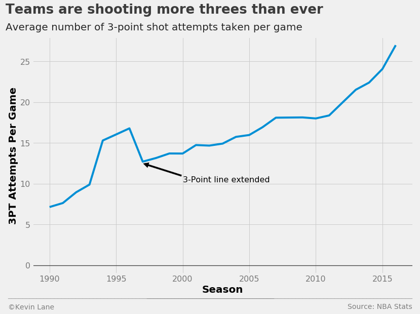
I first wanted to look at the rise of three-point shooting in the NBA. As discussed in the background, teams have been shooting more and more threes every season for a while because they are worth more in terms of expected value, and the data clearly indicates that. Since the three-point line was extended in 1997, teams have shot more threes the following season virtually every year.
fig = plt.figure(figsize=(12, 8))
plt.plot(data.SEASON, data.AVG3)
plt.annotate('3-Point line extended', xy=(1997, 12.5), xytext=(2000, 10.2), fontsize=16,
             arrowprops=dict(facecolor='black'))
plt.ylim(-1)
title = 'Teams are shooting more threes than ever'
subtitle = 'Average number of 3-point shot attempts taken per game'
format_538(fig, 'NBA Stats', xlabel='Season', ylabel='3PT Attempts Per Game',
           title=title, subtitle=subtitle, toff=(-0.07, 1.1), soff=(-0.07, 1.03))
plt.show()
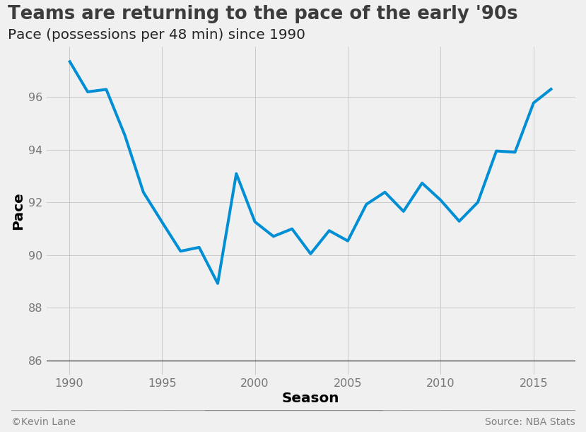
I next wanted to look at team pace, a measure of the number of possessions per 48 minutes (regulation game length). Teams played slower during the late ’90s and 2000s, but have been playing faster in recent seasons.
pace = season_stats.groupby('SEASON').PACE.mean()

fig = plt.figure(figsize=(12, 8))
plt.plot(pace.index[1:], pace[1:])

title = 'Teams are returning to the pace of the early \'90s'
subtitle = 'Pace (possessions per 48 min) since 1990'
format_538(fig, 'NBA Stats', xlabel='Season', ylabel='Pace',
           title=title, subtitle=subtitle, toff=(-0.07, 1.08), soff=(-0.07, 1.02), bottomtick=86)
plt.show()
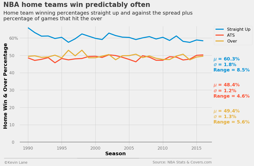
In terms of predicting game winners straight up, a reasonable baseline prediction without knowing what two teams are playing is probably that the home team wins. Let’s take a look at how often that actually happens in the NBA. The plot below shows the win percentage for all home teams across the league from 1990-2016. The chart along with the annotation show that the home team wins about 60% of the time historically. That rate is also remarkably consistent. It has a standard deviation of less than 2% and has stayed within about \(\pm\)4% since the 1990-91 season. FiveThirtyEight reported a similar percentage when analyzing home court/field/ice advantages of the four major American sports. They calculated that the home team in the NBA has won 59.9% of regular season games since the 2000 season. They also estimated that playing at home provides the biggest advantage in the NBA, where home teams win nearly 10% more games than expected had all games been played at neutral sites. Contrast that with MLB, where home teams win only 4% more games than expected. It is interesting to note that regardless of the sport, FiveThirtyEight’s models expect the “home” team to win about 50% of the time on neutral sites, which makes sense when averaged across all teams and multiple seasons.
The plot also shows winning percentage against the spread (ATS) and percentage of games that hit the over. It really shows how skilled oddsmakers are at setting point spreads and over/under lines given that both percentages do not deviate far from 50%. Both also have smaller standard deviations and ranges than the actual home win percentage.
wpct = data.HomeWinPct
wpct_ats = data.HomeWinPctATS
opct = data.OverPct

fig = plt.figure(figsize=(12, 8))
p = []
p += plt.plot(data.SEASON, wpct, label='Straight Up')
p += plt.plot(data.SEASON, wpct_ats, label='ATS')
p += plt.plot(data.SEASON, opct, label='Over')
plt.ylim(-2)

plt.text(2017.5, 41, '$\mu$ = {0:.1f}%\n$\sigma$ = {1:.1f}%\nRange = {2:.1f}%'
         .format(np.mean(wpct), np.std(wpct), np.ptp(wpct)),
         fontsize=18, fontweight='bold', color=p[0].get_color())
plt.text(2017.5, 26, '$\mu$ = {0:.1f}%\n$\sigma$ = {1:.1f}%\nRange = {2:.1f}%'
         .format(np.mean(wpct_ats), np.std(wpct_ats), np.ptp(wpct_ats)),
         fontsize=18, fontweight='bold', color=p[1].get_color())
plt.text(2017.5, 11, '$\mu$ = {0:.1f}%\n$\sigma$ = {1:.1f}%\nRange = {2:.1f}%'
         .format(np.mean(opct), np.std(opct), np.ptp(opct)),
         fontsize=18, fontweight='bold', color=p[2].get_color())

xlabel = 'Season'
ylabel = 'Home Win & Over Percentage'
title = 'NBA home teams win predictably often'
subtitle = '''Home team winning percentages straight up and against the spread plus
percentage of games that hit the over'''
plt.legend(fontsize=16, bbox_to_anchor=(1.01, 1), borderaxespad=0)
format_538(fig, 'NBA Stats & Covers.com', xlabel=xlabel, ylabel=ylabel, title=title, subtitle=subtitle,
           xoff=(-0.09, 1.01), toff=(-0.082, 1.16), soff=(-0.082, 1.05), suffix='%', suffix_offset=3)
plt.show()
Historically Great Teams
Now let’s look at some advanced stats calculated from the basic box score data. We are first going to look at teams that have some of the best offenses and defenses in NBA history. Since the team stats table includes a team ID that maps to a teams table, we need to pull in the teams table to better identify which teams we are looking at.
teams = pd.read_sql('SELECT * FROM TEAMS', conn)
Below are some limits for what defines a great offense, defense, and well-balanced team (high net rating). These limits are not formally defined and are merely selected such that the resulting number of teams is small.
off_lim = 114
def_lim = 98
net_lim = 9
off_flag = (season_stats.TEAM_OFF_RTG > off_lim) & (season_stats.SEASON >= 1990)
def_flag = (season_stats.TEAM_DEF_RTG < def_lim) & (season_stats.SEASON >= 1990)
net_flag = (season_stats.TEAM_NET_RTG > net_lim) & (season_stats.SEASON >= 1990)
stats = ['SEASON', 'TEAM_ID', 'TEAM_OFF_RTG', 'TEAM_DEF_RTG', 'TEAM_NET_RTG', 'TEAM_SRS']
There are 15 teams since the 1990-91 season with an offensive rating greater than 114 and 4 of them are Jordan-led Bulls teams. The only other teams to appear more than once are the Suns (one led by Charles Barkley and two by the duo of Steve Nash and Amar’e Stoudemire) and the Warriors (one led by hall of famer Chris Mullin and the 2015-17 teams). Note that the NBA’s database does not differentiate teams that change location and/or mascots, so the table identifies the 1994 Oklahoma City Thunder, even though they were actually the Seattle SuperSonics at the time.
# Isolate desired teams
best_off = season_stats.loc[off_flag, stats]

# Merge with teams table to add team information
best_off = teams.merge(best_off, left_on='ID', right_on='TEAM_ID')

# Remove ID columns
best_off = best_off[[c for c in best_off.columns if 'ID' not in c]]

# Sort by descending offensive rating
print_df(best_off.sort_values(by='TEAM_OFF_RTG', ascending=False))
| ABBREVIATION | CITY | MASCOT | SEASON | TEAM_OFF_RTG | TEAM_DEF_RTG | TEAM_NET_RTG | TEAM_SRS |
|---|---|---|---|---|---|---|---|
| CHI | Chicago | Bulls | 1991 | 116.189211 | 105.151816 | 11.037395 | 10.068209 |
| CHI | Chicago | Bulls | 1995 | 115.933867 | 102.438493 | 13.495374 | 11.799077 |
| ORL | Orlando | Magic | 1994 | 115.824746 | 108.447942 | 7.376804 | 6.438905 |
| GSW | Golden State | Warriors | 2016 | 115.569072 | 103.967168 | 11.601904 | 11.351390 |
| OKC | Oklahoma City | Thunder | 1994 | 115.429696 | 106.876043 | 8.553653 | 7.907164 |
| PHX | Phoenix | Suns | 2009 | 115.341356 | 110.211671 | 5.129685 | 4.677408 |
| CHI | Chicago | Bulls | 1990 | 115.229301 | 105.703474 | 9.525826 | 8.565998 |
| UTA | Utah | Jazz | 1994 | 114.985616 | 106.354448 | 8.631169 | 7.751535 |
| PHX | Phoenix | Suns | 1994 | 114.930813 | 110.902597 | 4.028215 | 3.849692 |
| HOU | Houston | Rockets | 2016 | 114.745295 | 109.006817 | 5.738478 | 5.844508 |
| PHX | Phoenix | Suns | 2004 | 114.531469 | 107.143974 | 7.387495 | 7.076859 |
| GSW | Golden State | Warriors | 2015 | 114.495585 | 103.776436 | 10.719149 | 10.380270 |
| CHI | Chicago | Bulls | 1996 | 114.352283 | 102.373550 | 11.978733 | 10.697142 |
| CLE | Cleveland | Cavaliers | 1991 | 114.335981 | 108.610216 | 5.725766 | 5.340416 |
| GSW | Golden State | Warriors | 1991 | 114.060850 | 110.310391 | 3.750460 | 3.766748 |
There are 11 teams since 1990 with a defensive rating under 98 and 3 of them are late 90s/early 2000s Spurs teams with Tim Duncan, two of which featured hall of famer David Robinson. What is more impressive is that they are the only team to grace this list more than once. I should note that all of these teams come from three seasons: 1998, 2000, and 2003. There was a lockout during the 1998 season that resulted in the lowest-scoring season since 1990. The 2000 and 2003 seasons were the next two lowest-scoring seasons after 1998, so these teams could just be a product of low league-wide scoring.
# Isolate desired teams
best_def = season_stats.loc[def_flag, stats]

# Merge with teams table to add team information
best_def = teams.merge(best_def, left_on='ID', right_on='TEAM_ID')

# Remove ID columns
best_def = best_def[[c for c in best_def.columns if 'ID' not in c]]

# Sort by ascending defensive rating
print_df(best_def.sort_values(by='TEAM_DEF_RTG'))
| ABBREVIATION | CITY | MASCOT | SEASON | TEAM_OFF_RTG | TEAM_DEF_RTG | TEAM_NET_RTG | TEAM_SRS |
|---|---|---|---|---|---|---|---|
| SAS | San Antonio | Spurs | 2003 | 102.248071 | 94.178366 | 8.069705 | 7.512427 |
| SAS | San Antonio | Spurs | 1998 | 104.036733 | 95.000784 | 9.035949 | 7.151218 |
| DET | Detroit | Pistons | 2003 | 102.057437 | 95.440557 | 6.616880 | 5.035363 |
| ATL | Atlanta | Hawks | 1998 | 100.516244 | 97.138526 | 3.377719 | 2.790164 |
| IND | Indiana | Pacers | 2003 | 103.866828 | 97.324036 | 6.542792 | 4.932295 |
| ORL | Orlando | Magic | 1998 | 100.297189 | 97.382225 | 2.914964 | 3.082168 |
| NYK | New York | Knicks | 1998 | 98.636273 | 97.471817 | 1.164456 | 1.423433 |
| PHI | Philadelphia | 76ers | 1998 | 99.928127 | 97.632210 | 2.295917 | 2.528796 |
| POR | Portland | Trail Blazers | 1998 | 104.759421 | 97.734222 | 7.025199 | 5.697009 |
| SAS | San Antonio | Spurs | 2000 | 106.556068 | 97.962401 | 8.593667 | 7.916999 |
| PHX | Phoenix | Suns | 2000 | 100.321422 | 97.966276 | 2.355146 | 2.626301 |
The 17 teams listed below have a net rating greater than 9 and are some of the strongest teams in NBA history. These include 4 of the Jordan-led Bulls and the last three Warriors teams. Only one of the strong defensive teams isolated above make the cut, while 6 of the strong offensive teams appear. As before, note that the 1993 Oklahoma City Thunder were in fact the Seattle SuperSonics.
# Isolate desired teams
best_net = season_stats.loc[net_flag, stats]

# Merge with teams table to add team information
best_net = teams.merge(best_net, left_on='ID', right_on='TEAM_ID')

# Remove ID columns
best_net = best_net[[c for c in best_net.columns if 'ID' not in c]]

# Sort by descending net rating
print_df(best_net.sort_values(by='TEAM_NET_RTG', ascending=False))
| ABBREVIATION | CITY | MASCOT | SEASON | TEAM_OFF_RTG | TEAM_DEF_RTG | TEAM_NET_RTG | TEAM_SRS |
|---|---|---|---|---|---|---|---|
| CHI | Chicago | Bulls | 1995 | 115.933867 | 102.438493 | 13.495374 | 11.799077 |
| CHI | Chicago | Bulls | 1996 | 114.352283 | 102.373550 | 11.978733 | 10.697142 |
| GSW | Golden State | Warriors | 2016 | 115.569072 | 103.967168 | 11.601904 | 11.351390 |
| SAS | San Antonio | Spurs | 2015 | 110.290021 | 98.962236 | 11.327785 | 10.276618 |
| BOS | Boston | Celtics | 2007 | 110.171323 | 98.933715 | 11.237609 | 9.307345 |
| CHI | Chicago | Bulls | 1991 | 116.189211 | 105.151816 | 11.037395 | 10.068209 |
| GSW | Golden State | Warriors | 2015 | 114.495585 | 103.776436 | 10.719149 | 10.380270 |
| GSW | Golden State | Warriors | 2014 | 111.603607 | 101.354296 | 10.249311 | 10.008125 |
| CLE | Cleveland | Cavaliers | 2008 | 112.441598 | 102.432204 | 10.009394 | 8.680389 |
| OKC | Oklahoma City | Thunder | 2012 | 112.398592 | 102.609581 | 9.789011 | 9.149670 |
| UTA | Utah | Jazz | 1996 | 113.642224 | 103.950239 | 9.691985 | 7.969128 |
| OKC | Oklahoma City | Thunder | 1993 | 111.969516 | 102.366973 | 9.602543 | 8.675828 |
| CHI | Chicago | Bulls | 1990 | 115.229301 | 105.703474 | 9.525826 | 8.565998 |
| SAS | San Antonio | Spurs | 2006 | 109.199410 | 99.859543 | 9.339868 | 8.347217 |
| CHI | Chicago | Bulls | 2011 | 107.405392 | 98.284632 | 9.120760 | 7.426924 |
| LAL | Los Angeles | Lakers | 1999 | 107.325502 | 98.224840 | 9.100663 | 8.413792 |
| SAS | San Antonio | Spurs | 1998 | 104.036733 | 95.000784 | 9.035949 | 7.151218 |
The following table shows all NBA champions since the 1990-91 season. Not surprisingly, most of the champions have solid net ratings and SRS numbers with the 1995 Bulls shining above all other teams. The weakest champion by these measures is the 1994 Rockets led by hall of famers Hakeem Olajuwon and Clyde Drexler while Michael Jordan was off playing baseball. The 1993 champion Rockets were not much better at fourth from the bottom.
# Create champions table that identifies which team won the NBA championship each season
champs = pd.DataFrame({'SEASON': range(1990, 2017),
                       'ABBREVIATION': ['CHI', 'CHI', 'CHI', 'HOU', 'HOU', 'CHI', 'CHI', 'CHI', 'SAS',
                                        'LAL', 'LAL', 'LAL', 'SAS', 'DET', 'SAS', 'MIA', 'SAS', 'BOS',
                                        'LAL', 'LAL', 'DAL', 'MIA', 'MIA', 'SAS', 'GSW', 'CLE', 'GSW']})
# Isolate desired stats from all teams
champ_stats = season_stats[stats]

# Merge with teams table to add team information
champ_stats = teams.merge(champ_stats, left_on='ID', right_on='TEAM_ID')

# Merge with champs table created above
columns = ['ABBREVIATION', 'SEASON']
champ_stats = champs.merge(champ_stats, left_on=columns, right_on=columns)

# Remove ID columns
champ_stats = champ_stats[[c for c in champ_stats.columns if 'ID' not in c]]
print_df(champ_stats.sort_values(by='TEAM_SRS', ascending=False))
| ABBREVIATION | SEASON | CITY | MASCOT | TEAM_OFF_RTG | TEAM_DEF_RTG | TEAM_NET_RTG | TEAM_SRS |
|---|---|---|---|---|---|---|---|
| CHI | 1995 | Chicago | Bulls | 115.933867 | 102.438493 | 13.495374 | 11.799077 |
| GSW | 2016 | Golden State | Warriors | 115.569072 | 103.967168 | 11.601904 | 11.351390 |
| CHI | 1996 | Chicago | Bulls | 114.352283 | 102.373550 | 11.978733 | 10.697142 |
| CHI | 1991 | Chicago | Bulls | 116.189211 | 105.151816 | 11.037395 | 10.068209 |
| GSW | 2014 | Golden State | Warriors | 111.603607 | 101.354296 | 10.249311 | 10.008125 |
| BOS | 2007 | Boston | Celtics | 110.171323 | 98.933715 | 11.237609 | 9.307345 |
| CHI | 1990 | Chicago | Bulls | 115.229301 | 105.703474 | 9.525826 | 8.565998 |
| LAL | 1999 | Los Angeles | Lakers | 107.325502 | 98.224840 | 9.100663 | 8.413792 |
| SAS | 2006 | San Antonio | Spurs | 109.199410 | 99.859543 | 9.339868 | 8.347217 |
| SAS | 2013 | San Antonio | Spurs | 110.501196 | 102.404512 | 8.096684 | 7.994012 |
| SAS | 2004 | San Antonio | Spurs | 107.496327 | 98.774515 | 8.721811 | 7.835147 |
| CHI | 1997 | Chicago | Bulls | 107.696343 | 99.779691 | 7.916652 | 7.244613 |
| SAS | 1998 | San Antonio | Spurs | 104.036733 | 95.000784 | 9.035949 | 7.151218 |
| LAL | 2001 | Los Angeles | Lakers | 109.407427 | 101.713071 | 7.694357 | 7.145147 |
| LAL | 2008 | Los Angeles | Lakers | 112.815873 | 104.735539 | 8.080334 | 7.112944 |
| MIA | 2012 | Miami | Heat | 112.332835 | 103.744087 | 8.588748 | 7.031001 |
| CHI | 1992 | Chicago | Bulls | 113.620324 | 106.822864 | 6.797459 | 6.192637 |
| MIA | 2011 | Miami | Heat | 106.630278 | 100.150438 | 6.479840 | 5.719582 |
| SAS | 2002 | San Antonio | Spurs | 105.629877 | 99.659960 | 5.969917 | 5.649958 |
| CLE | 2015 | Cleveland | Cavaliers | 110.873303 | 104.496954 | 6.376349 | 5.452116 |
| DET | 2003 | Detroit | Pistons | 102.057437 | 95.440557 | 6.616880 | 5.035363 |
| LAL | 2009 | Los Angeles | Lakers | 108.764387 | 103.716801 | 5.047586 | 4.782049 |
| DAL | 2010 | Dallas | Mavericks | 109.671262 | 105.041587 | 4.629675 | 4.407577 |
| HOU | 1993 | Houston | Rockets | 106.444671 | 101.900362 | 4.544309 | 4.194021 |
| LAL | 2000 | Los Angeles | Lakers | 108.435083 | 104.794734 | 3.640349 | 3.742580 |
| MIA | 2005 | Miami | Heat | 108.659652 | 104.454414 | 4.205239 | 3.592696 |
| HOU | 1994 | Houston | Rockets | 110.403045 | 108.140634 | 2.262411 | 2.318131 |
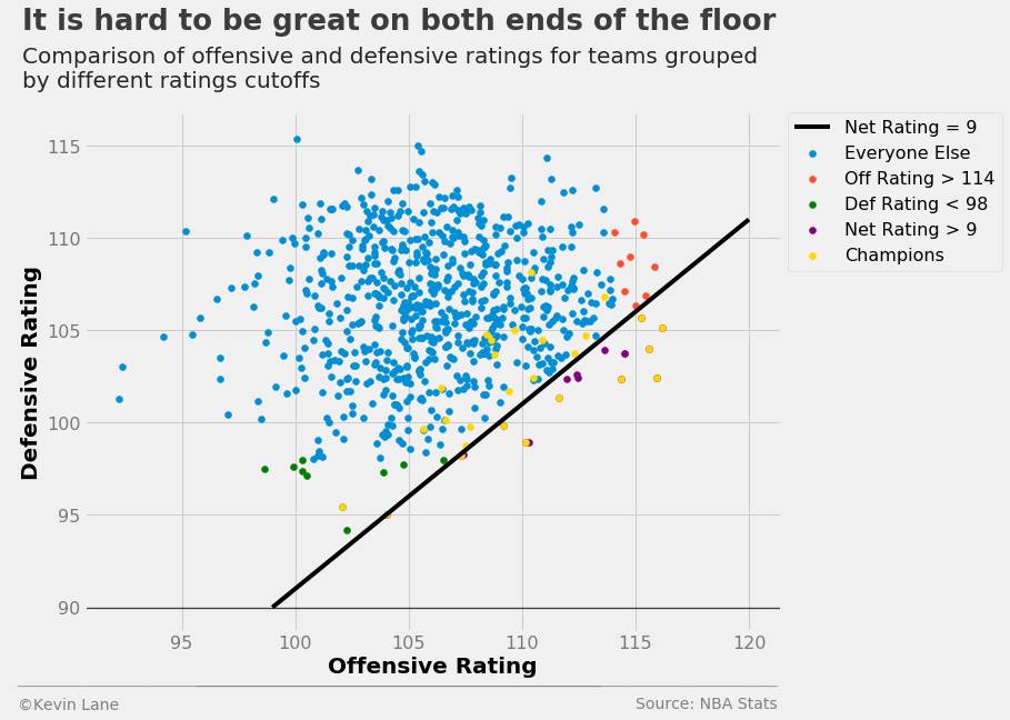
The scatter plot below shows all teams since 1990 represented by their offensive and defensive ratings. The strongest teams are towards the bottom right, those that score a lot and do not give up many points. The line represents a constant net rating of 9, below which are the 16 teams listed above that have a net rating greater than 9.
# Add line of constant net rating
x = np.array([99, 120])
fig = plt.figure(figsize=(10, 8))
plt.plot(x, x-net_lim, 'black', label='Net Rating = {:d}'.format(net_lim))

# Isolate teams that do not make the offensive/defensive/net rating cutoffs
others = season_stats.loc[~off_flag & ~def_flag & ~net_flag & (season_stats.SEASON >= 1990), stats]
others = teams.merge(others, left_on='ID', right_on='TEAM_ID')

# Remove the champions with an outer join
columns = ['ABBREVIATION', 'SEASON']
others = champs.merge(others, left_on=columns, right_on=columns, how='outer', indicator=True)
others = others[others._merge == 'right_only']

# Plot data
plt.scatter(x='TEAM_OFF_RTG', y='TEAM_DEF_RTG', data=others, label='Everyone Else')
plt.scatter(x='TEAM_OFF_RTG', y='TEAM_DEF_RTG', data=best_off, label='Off Rating > {:d}'.format(off_lim))
plt.scatter(x='TEAM_OFF_RTG', y='TEAM_DEF_RTG', data=best_def, label='Def Rating < {:d}'.format(def_lim),
            color='green')
plt.scatter(x='TEAM_OFF_RTG', y='TEAM_DEF_RTG', data=best_net, label='Net Rating > {:d}'.format(net_lim),
            color='purple')
plt.scatter(x='TEAM_OFF_RTG', y='TEAM_DEF_RTG', data=champ_stats, label='Champions', color='gold')

# Add legend for format plot
plt.legend(fontsize=16, bbox_to_anchor=(1.01, 1), borderaxespad=0)
title = 'It is hard to be great on both ends of the floor'
subtitle = '''Comparison of offensive and defensive ratings for teams grouped
by different ratings cutoffs'''
format_538(fig, 'NBA Stats', xlabel='Offensive Rating', ylabel='Defensive Rating', title=title,
           subtitle=subtitle, xoff=(-0.11, 1.01), toff=(-0.09, 1.16), soff=(-0.09, 1.05), bottomtick=90)
plt.show()
Team Strength Distribution
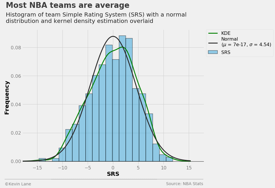
The histogram and kernel density estimation (KDE) of team SRS below show that teams are fairly normally distributed. The best fit normal distribution has a mean of essentially zero with a standard deviation of about 4.5 points. A zero-mean distribution makes sense here because an SRS of zero by definition indicates a perfectly average team.
srs = season_stats['TEAM_SRS']
(mu, sigma) = norm.fit(srs)

fig = plt.figure(figsize=(10, 8))
sns.distplot(srs, fit=norm, kde=True, kde_kws={'label': 'KDE', 'color': 'green', 'linewidth': 3},
             hist_kws={'label': 'SRS', 'edgecolor': 'k', 'linewidth': 2},
             fit_kws={'label': 'Normal\n($\mu$ = {0:.2g}, $\sigma$ = {1:.2f})'
                      .format(mu, sigma), 'linewidth': 3})
plt.xlim(-18, 18)
plt.ylim(-0.0025)
plt.legend(fontsize=16, bbox_to_anchor=(1.38, 1), borderaxespad=0)
title = 'Most NBA teams are average'
subtitle = '''Histogram of team Simple Rating System (SRS) with a normal
distribution and kernel density estimation overlaid'''
format_538(fig, 'NBA Stats', xlabel='SRS', ylabel='Frequency', title=title,
           subtitle=subtitle, xoff=(-0.11, 1.01), toff=(-0.09, 1.16), soff=(-0.09, 1.05))
plt.show()
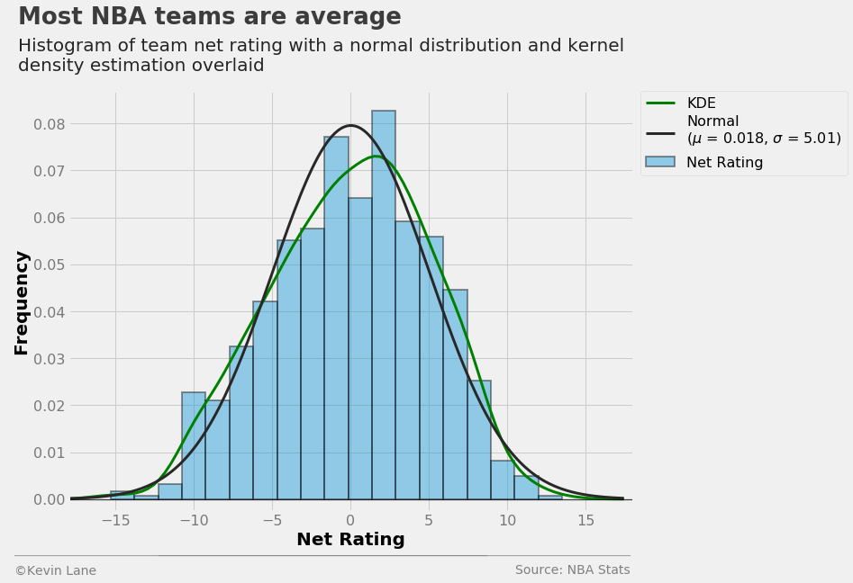
The histogram and KDE of net rating below appears similar to that for SRS, but the mean is not as small.
net_rtg = season_stats['TEAM_NET_RTG']
(mu, sigma) = norm.fit(net_rtg)

fig = plt.figure(figsize=(10, 8))
sns.distplot(net_rtg, fit=norm, kde=True, kde_kws={'label': 'KDE', 'color': 'green', 'linewidth': 3},
             hist_kws={'label': 'Net Rating', 'edgecolor': 'k', 'linewidth': 2},
             fit_kws={'label': 'Normal\n($\mu$ = {0:.2g}, $\sigma$ = {1:.2f})'
                      .format(mu, sigma), 'linewidth': 3})
plt.xlim(-18, 18)
plt.ylim(-0.0025)
plt.legend(fontsize=16, bbox_to_anchor=(1.38, 1), borderaxespad=0)
title = 'Most NBA teams are average'
subtitle = '''Histogram of team net rating with a normal distribution and kernel
density estimation overlaid'''
format_538(fig, 'NBA Stats', xlabel='Net Rating', ylabel='Frequency', title=title,
           subtitle=subtitle, xoff=(-0.11, 1.01), toff=(-0.09, 1.16), soff=(-0.09, 1.05))
plt.show()
Home vs. Away Strength
The next step is to look at games in terms of home and away team stats. The code below joins the games table with the stats table initially by home team stats and followed by away team stats.
seasons = season_stats.filter(regex='SEASON|TEAM')
games = pd.read_sql('SELECT * FROM games JOIN betting ON games.ID is betting.GAME_ID', conn)
games = games.merge(seasons, left_on=['SEASON', 'HOME_TEAM_ID'], right_on=['SEASON', 'TEAM_ID'])
games = games.merge(seasons, left_on=['SEASON', 'AWAY_TEAM_ID'], right_on=['SEASON', 'TEAM_ID'],
                    suffixes=('', '_AWAY'))
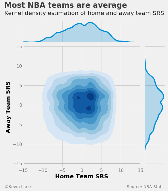
The plot below shows a 2D KDE that compares home and away team SRS. By inspection, the majority of games occur between teams with SRS values within 5 points of average. This makes intuitive sense given the standard deviation of 4.5 points calculated above. Assuming the Gaussian distribution above, more than 68% of all teams since 1990 have SRS values with a magnitude less than 5 based on the definition of a normal distribution. The distribution appears symmetric about a y=x line because under normal circumstances (each team plays a full season), teams have the same number of home and away games.
ax = sns.jointplot(x='TEAM_SRS', y='TEAM_SRS_AWAY', data=games, kind='kde', cmap='Blues',
                   shade_lowest=False, stat_func=None, xlim=(-15, 15), ylim=(-15, 15), size=8)
ax.set_axis_labels(xlabel='Home Team SRS', ylabel='Away Team SRS')

plt.ylim(-16)
title = 'Most NBA teams are average'
subtitle = '''Kernel density estimation of home and away team SRS'''
format_538(plt.gcf(), 'NBA Stats', ax=ax.ax_joint, title=title, subtitle=subtitle, xoff=(-0.18, 1.22),
           yoff=(-0.12, -0.17), toff=(-0.16, 1.32), soff=(-0.16, 1.26), bottomtick=-15, n=50)
plt.show()
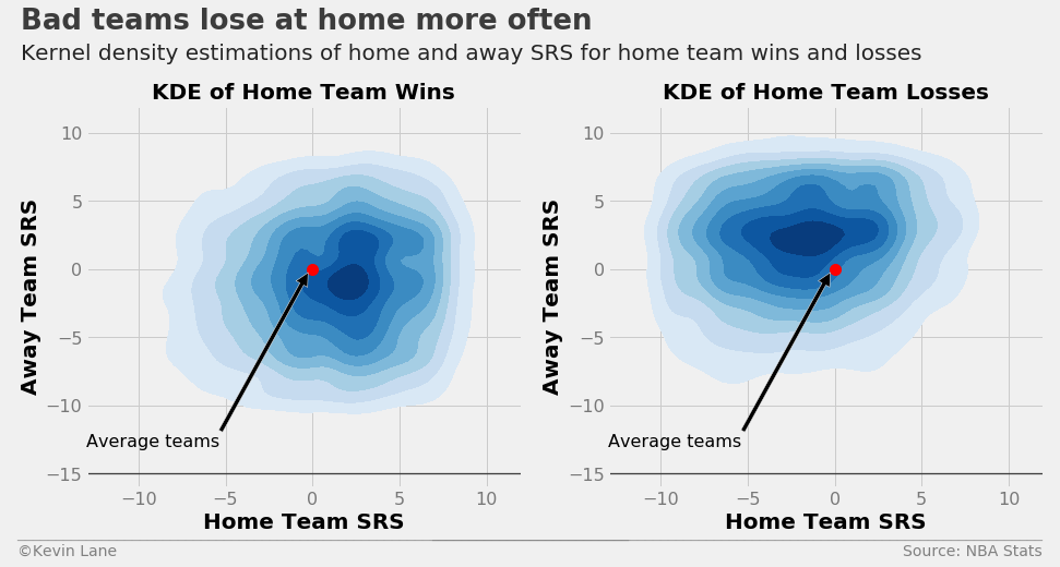
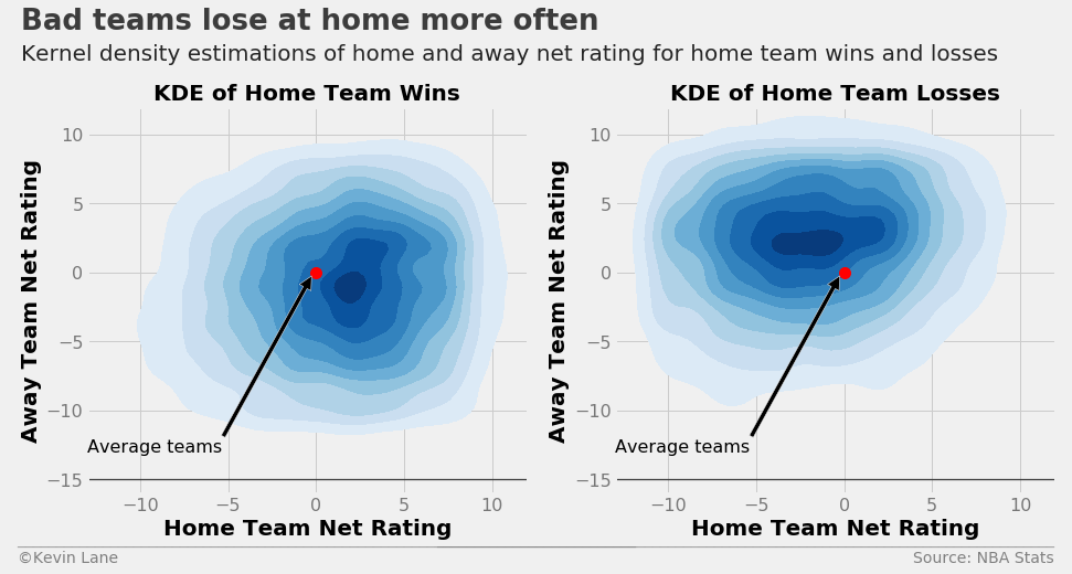
A better view of this data is to separate games into home team wins and losses. The plots below show KDE plots of SRS for home team wins and losses with a red marker added to easily identify the origin (average home and away teams). The high-density area towards the lower right of the origin for home team wins (left plot) indicates there are many games in the dataset where above-average home teams beat below-average away teams, which is not a surprising revelation. We draw the opposite conclusion for home team losses. The highest density occurs towards the upper left of the origin, meaning games where a below-average home team plays an above-average visiting teams typically does not go well for the home team.
fig = plt.figure(figsize=(14, 6))
ax1 = plt.subplot(121)
ax2 = plt.subplot(122)

# Find games where the home team won
kde(games[games.HOME_WL=='W'], 'SRS', 'SRS', 'KDE of Home Team Wins', ax1)

# Find games where the home team lost
kde(games[games.HOME_WL=='L'], 'SRS', 'SRS', 'KDE of Home Team Losses', ax2)

title = 'Bad teams lose at home more often'
subtitle = 'Kernel density estimations of home and away SRS for home team wins and losses'
format_538(fig, 'NBA Stats', ax=(ax1, ax2), title=title, subtitle=subtitle, xoff=(-0.18, 2.22),
           yoff=(-0.13, -0.18), toff=(-.15, 1.2), soff=(-0.15, 1.12), bottomtick=[-15, -15], n=80)
plt.show()
The KDE plots below repeat those above using team net ratings (offensive rating - defensive rating). They illustrate that the same trends hold true for net ratings as did for SRS above.
fig = plt.figure(figsize=(14, 6))
ax1 = plt.subplot(121)
ax2 = plt.subplot(122)

# Find games where the home team won
kde(games[games.HOME_WL=='W'], 'NET_RTG', 'Net Rating', 'KDE of Home Team Wins', ax1)

# Find games where the home team lost
kde(games[games.HOME_WL=='L'], 'NET_RTG', 'Net Rating', 'KDE of Home Team Losses', ax2)

title = 'Bad teams lose at home more often'
subtitle = 'Kernel density estimations of home and away net rating for home team wins and losses'
format_538(fig, 'NBA Stats', ax=(ax1, ax2), title=title, subtitle=subtitle, xoff=(-0.18, 2.22),
           yoff=(-0.13, -0.18), toff=(-.15, 1.2), soff=(-0.15, 1.12), bottomtick=[-15, -15], n=80)
plt.show()
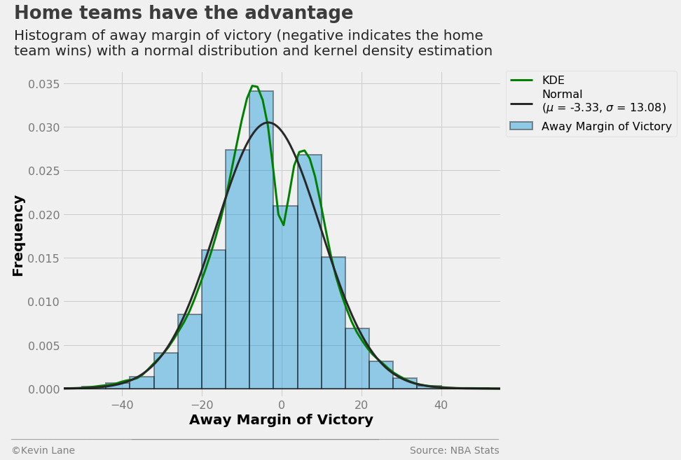
The histogram below shows away team margin of victory (away points - home points). I chose away margin of victory because the values tend to be negative since home teams win more often than not. This allows them to be compared to home team point spreads. The average game in the database has the home team winning by 3.3 points. The distribution is bimodal with a drop at zero, which makes sense since games cannot end in ties.
mov = pd.read_sql('''
    SELECT SEASON, PLUS_MINUS
    FROM team_game_stats
    JOIN games
    ON team_game_stats.GAME_ID IS games.ID
    AND team_game_stats.TEAM_ID = games.AWAY_TEAM_ID''', conn)


mov = mov.PLUS_MINUS
(mu, sigma) = norm.fit(mov)

fig = plt.figure(figsize=(10, 8))
ax = sns.distplot(mov, bins=20, fit=norm, kde=True,
                  kde_kws={'label': 'KDE', 'color': 'green', 'linewidth': 3},
                  hist_kws={'label': 'Away Margin of Victory', 'edgecolor': 'k', 'linewidth': 2},
                  fit_kws={'label': 'Normal\n($\mu$ = {0:.2f}, $\sigma$ = {1:.2f})'.format(mu, sigma),
                           'linewidth': 3})
plt.xlabel('Away Margin of Victory')
plt.ylabel('Frequency')
plt.xlim(-55, 55)
plt.ylim(-0.001)
ax.legend(fontsize=16, bbox_to_anchor=(1.4, 1), borderaxespad=0)

title = 'Home teams have the advantage'
subtitle = '''Histogram of away margin of victory (negative indicates the home
team wins) with a normal distribution and kernel density estimation'''
format_538(fig, 'NBA Stats', title=title, subtitle=subtitle, xoff=(-0.13, 1.01),
           toff=(-0.11, 1.16), soff=(-0.11, 1.05), yoff=(-0.12, -0.17))
plt.show()
Point Spreads
Next I start adding in betting data beginning with point spreads. The data frame below shows the information stored in the betting and games tables with game and team IDs removed.
bets = pd.read_sql('''
    SELECT * FROM games
    JOIN betting
    ON games.ID is betting.GAME_ID
    ORDER BY GAME_DATE''', conn)
bets = bets.drop(['ID', 'GAME_ID', 'HOME_TEAM_ID', 'AWAY_TEAM_ID'], 1)
print_df(bets.tail())
| SEASON | GAME_DATE | MATCHUP | HOME_WL | OVER_UNDER | OU_RESULT | HOME_SPREAD | HOME_SPREAD_WL |
|---|---|---|---|---|---|---|---|
| 2016 | 2017-04-12 | IND vs. ATL | W | 200.0 | U | -15.0 | W |
| 2016 | 2017-04-12 | UTA vs. SAS | W | 192.0 | O | -4.0 | P |
| 2016 | 2017-04-12 | POR vs. NOP | L | 203.0 | P | -7.0 | L |
| 2016 | 2017-04-12 | MEM vs. DAL | L | 189.5 | O | -8.5 | L |
| 2016 | 2017-04-12 | CLE vs. TOR | L | 201.0 | U | 3.0 | L |
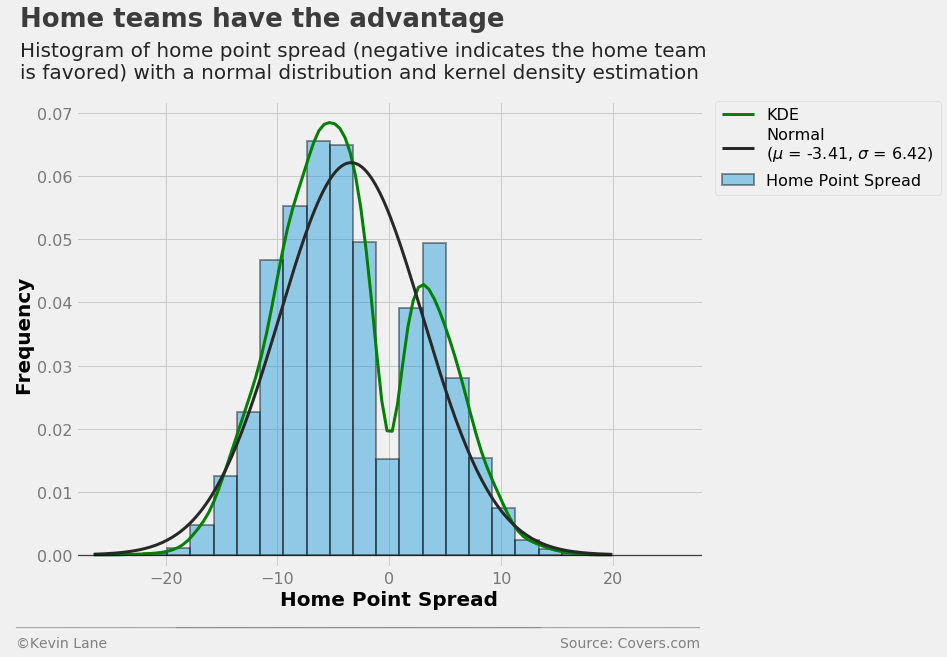
The histogram below shows home team point spread. It is similar to the one above with away margin of victory, except the range is much smaller. This makes sense because there will only be action on one side of a bet if oddsmakers set the point spread to too extreme a value.
bets = pd.read_sql('SELECT * FROM betting', conn)
spread = bets.HOME_SPREAD.dropna()
(mu, sigma) = norm.fit(spread)

fig = plt.figure(figsize=(10, 8))
ax = sns.distplot(spread, bins=20, fit=norm, kde=True,
                  kde_kws={'label': 'KDE', 'color': 'green', 'linewidth': 3},
                  hist_kws={'label': 'Home Point Spread', 'edgecolor': 'k', 'linewidth': 2},
                  fit_kws={'label': 'Normal\n($\mu$ = {0:.2f}, $\sigma$ = {1:.2f})'.format(mu, sigma),
                           'linewidth': 3})
plt.xlabel('Home Point Spread')
plt.ylabel('Frequency')
plt.xlim(-28, 28)
plt.ylim(-0.002)
plt.legend(fontsize=16, bbox_to_anchor=(1.38, 1), borderaxespad=0)

title = 'Home teams have the advantage'
subtitle = '''Histogram of home point spread (negative indicates the home team
is favored) with a normal distribution and kernel density estimation'''
format_538(fig, 'Covers.com', title=title, subtitle=subtitle, xoff=(-0.11, 1.01),
           toff=(-0.09, 1.16), soff=(-0.09, 1.05), yoff=(-0.12, -0.17))
plt.show()
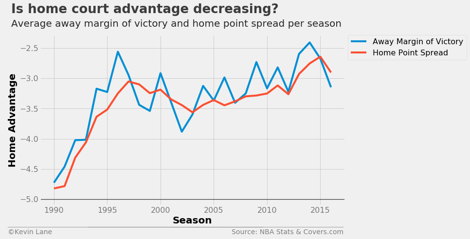
The plot below shows that home court advantage (in the form of both away margin of victory and home point spread) have been decreasing in recent years.
data_mov = pd.read_sql('''
    SELECT
        SEASON,
        AVG(PLUS_MINUS) as AVG_PLUS_MINUS
    FROM team_game_stats
    JOIN games
    ON team_game_stats.GAME_ID IS games.ID
    AND team_game_stats.TEAM_ID = games.AWAY_TEAM_ID
    WHERE SEASON >= 1990
    GROUP BY SEASON''', conn)

fig = plt.figure(figsize=(10, 6))
plt.plot(data_mov.SEASON, data_mov.AVG_PLUS_MINUS, label='Away Margin of Victory')
plt.plot(data.SEASON, data.AVG_HOME_SPREAD, label='Home Point Spread')
plt.xlabel('Season')
plt.ylabel('Home Advantage')
plt.legend(fontsize=16, bbox_to_anchor=(1.01, 1), borderaxespad=0)
plt.ylim(-5.1)

title = 'Is home court advantage decreasing?'
subtitle = 'Average away margin of victory and home point spread per season'
format_538(fig, 'NBA Stats & Covers.com', title=title, subtitle=subtitle, xoff=(-0.12, 1.01),
           yoff=(-0.12, -0.17), toff=(-0.094, 1.13), soff=(-0.094, 1.05), bottomtick=-5)
plt.show()
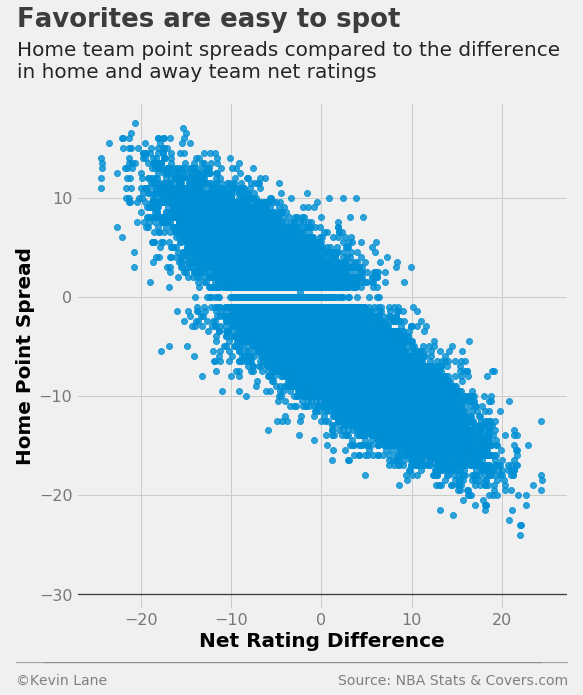
The scatterplot below compares home point spread with the difference in home and away net ratings. There appears to be a fairly linear relationship with a negative y-intercept since the average home point spread is negative. There are a number of pick ‘em games (zero point spread), but oddsmakers almost never set a point spread of \(\pm\)0.5.
games['NET_RTG'] = games.TEAM_NET_RTG - games.TEAM_NET_RTG_AWAY
games = games.dropna()

ax = sns.lmplot(x='NET_RTG', y='HOME_SPREAD', data=games, fit_reg=False, size=8)
plt.xlabel('Net Rating Difference')
plt.ylabel('Home Point Spread')
plt.ylim(-31.5)

title = 'Favorites are easy to spot'
subtitle = '''Home team point spreads compared to the difference
in home and away team net ratings'''
format_538(plt.gcf(), 'NBA Stats & Covers.com', title=title, subtitle=subtitle,
           xoff=(-0.14, 1.02), toff=(-0.12, 1.15), soff=(-0.12, 1.05), bottomtick=-30)
plt.show()
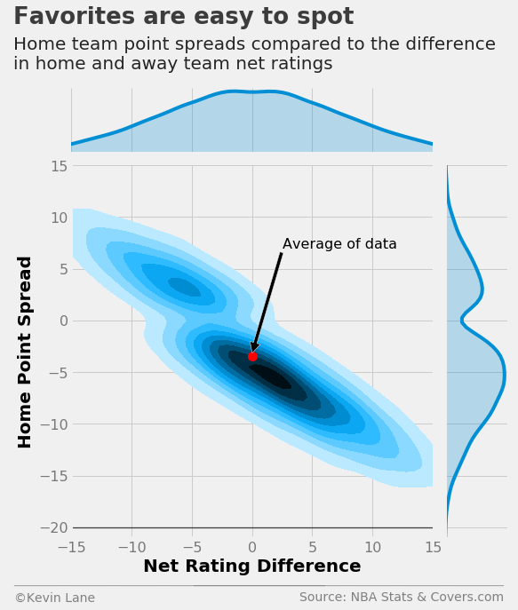
It is difficult to discern densities from the scatterplot above, so I replotted the same data as a KDE. It clearly shows that points spreads favor the home team when the teams are evenly matched (equal net ratings).
mean_net_rtg = games.NET_RTG.mean()
ax = sns.jointplot(x='NET_RTG', y='HOME_SPREAD', data=games, kind='kde',
                  shade_lowest=False, stat_func=None, xlim=(-15, 15), ylim=(-15, 15), size=8)
ax.set_axis_labels(xlabel='Net Rating Difference', ylabel='Home Point Spread')
ax.ax_joint.plot(mean_net_rtg, mu, 'or', markersize=10)
ax.ax_joint.annotate('Average of data', xy=(mean_net_rtg, mu+0.25), xytext=(2.5, 7), fontsize=16,
                     arrowprops=dict(facecolor='black'))
plt.ylim(-21)

source = 'NBA Stats & Covers.com'
title = 'Favorites are easy to spot'
subtitle = '''Home team point spreads compared to the difference
in home and away team net ratings'''
format_538(plt.gcf(), source=source, ax=ax.ax_joint, title=title, subtitle=subtitle, n=50,
           xoff=(-0.18, 1.22), yoff=(-0.12, -0.17), toff=(-0.16, 1.38), soff=(-0.16, 1.26),
           bottomtick=-20)
plt.show()
Over/Under Lines
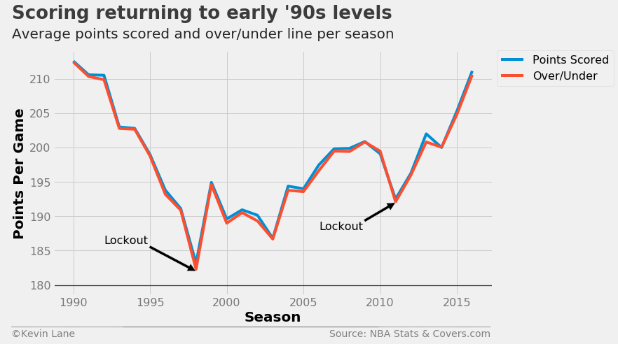
I now switch gears to investigate over/under lines. The plot below compares total points scored per game with average over/under lines. It is remarkable how closely the over/under lines track with points scored. Two significant drops in scoring occurred during the 1998 and 2011 seasons, which were lockout-shortened seasons. One explanation for this is that players are not in the best shape coming out of a lockout and scoring suffers as a result. The trend also closely resembles that from the plot of team pace above, which makes sense because changes to game pace directly impacts the number of scoring opportunities teams have.
fig = plt.figure(figsize=(10, 6))
plt.plot(data.SEASON, data.AVG_PTS, label='Points Scored')
plt.plot(data.SEASON, data.AVG_OVER_UNDER, label='Over/Under')
plt.annotate('Lockout', xy=(1998, 182), xytext=(1992, 186), fontsize=16,
             arrowprops=dict(facecolor='black'))
plt.annotate('Lockout', xy=(2011, 192), xytext=(2006, 188), fontsize=16,
             arrowprops=dict(facecolor='black'))
plt.xlabel('Season')
plt.ylabel('Points Per Game')
plt.ylim(178.5)
plt.legend(fontsize=16, bbox_to_anchor=(1.01, 1), borderaxespad=0)

title = 'Scoring returning to early \'90s levels'
subtitle = 'Average points scored and over/under line per season'
format_538(fig, 'NBA Stats & Covers.com', title=title, subtitle=subtitle, xoff=(-0.11, 1.01),
           yoff=(-0.12, -0.17), toff=(-0.094, 1.13), soff=(-0.094, 1.05), bottomtick=180)
plt.show()
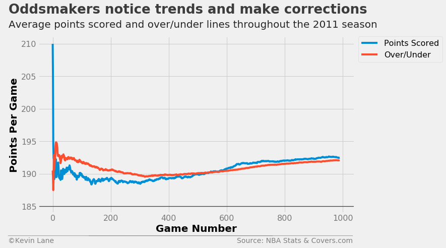
Since oddsmakers get average scoring dead on by the end of the season, I wanted to see how close they were throughout the entire season. The plot below shows expanding means of total points scored and over/under lines throughout the strike-shortened 2011 season. Oddsmakers started their lines out too high, but gradually reduced their lines until they started tracking with actual points scored.
season = 2011
data = pd.read_sql('''
    SELECT
        2 * AVG(PTS) as TOTAL_PTS,
        OVER_UNDER
    FROM games
    JOIN team_game_stats ON games.ID IS team_game_stats.GAME_ID
    JOIN betting ON games.ID IS betting.GAME_ID
    WHERE SEASON == {:d}
    GROUP BY GAME_DATE, ID'''.format(season), conn)

x = range(0, len(data))
fig = plt.figure(figsize=(10, 6))
plt.plot(x, data.TOTAL_PTS.expanding().mean(), label='Points Scored')
plt.plot(x, data.OVER_UNDER.expanding().mean(), label='Over/Under')
plt.xlabel('Game Number')
plt.ylabel('Points Per Game')
plt.legend(fontsize=16, bbox_to_anchor=(1.28, 1), borderaxespad=0)
plt.ylim(184)

title = 'Oddsmakers notice trends and make corrections'
subtitle = 'Average points scored and over/under lines throughout the {:d} season'.format(season)
format_538(fig, 'NBA Stats & Covers.com', title=title, subtitle=subtitle, xoff=(-0.11, 1.01),
           yoff=(-0.12, -0.17), toff=(-0.094, 1.13), soff=(-0.094, 1.05), bottomtick=185)
plt.show()
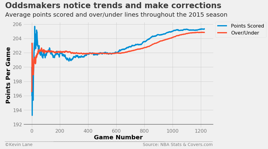
Another interesting season was 2015, where oddsmakers held the average over/under line relatively constant during the first half, but scoring increased during the second half and oddsmakers had to adjust their over/under lines accordingly.
season = 2015
data = pd.read_sql('''
    SELECT
        2 * AVG(PTS) as TOTAL_PTS,
        OVER_UNDER
    FROM games
    JOIN team_game_stats ON games.ID IS team_game_stats.GAME_ID
    JOIN betting ON games.ID IS betting.GAME_ID
    WHERE SEASON == {:d}
    GROUP BY GAME_DATE, ID'''.format(season), conn)

x = range(0, len(data))
fig = plt.figure(figsize=(10, 6))
plt.plot(x, data.TOTAL_PTS.expanding().mean(), label='Points Scored')
plt.plot(x, data.OVER_UNDER.expanding().mean(), label='Over/Under')
plt.xlabel('Game Number')
plt.ylabel('Points Per Game')
plt.legend(fontsize=16, bbox_to_anchor=(1.01, 1), borderaxespad=0)
plt.ylim(191.5)

title = 'Oddsmakers notice trends and make corrections'
subtitle = 'Average points scored and over/under lines throughout the {:d} season'.format(season)
format_538(fig, 'NBA Stats & Covers.com', title=title, subtitle=subtitle, xoff=(-0.11, 1.01),
           yoff=(-0.12, -0.17), toff=(-0.094, 1.13), soff=(-0.094, 1.05), bottomtick=192)
plt.show()
The final plot compares over/under lines with the sum of team mean ratings, where mean rating is defined as the mean of offensive and defensive rating. Here I add defensive rating instead of subtract it because an increase in defensive rating, all else being equal, should coincide with an increase in total points scored. The trend appears fairly linear with the spread increasing with higher mean ratings. The few outliers above 250 are from 1990 when teams scored more points, though we may see over/under lines crack 250 again soon if scoring continues to increase. The two major outliers on the low end were parsed correctly from the website, so they clearly must have been entered incorrectly. Given the range of over/under lines, the left point is most likely intended to be 180.5 instead of 80.5 and the right 222 instead of 22.
pts = (games.TEAM_OFF_RTG + games.TEAM_DEF_RTG + games.TEAM_OFF_RTG_AWAY + games.TEAM_DEF_RTG_AWAY) / 2
fig = plt.figure(figsize=(10, 6))
plt.scatter(pts, games['OVER_UNDER'])
plt.annotate('Website Error', xy=(203, 82), xytext=(208, 110), fontsize=16,
             arrowprops=dict(facecolor='black'))
plt.annotate('Website Error', xy=(220, 25), xytext=(211, 60), fontsize=16,
             arrowprops=dict(facecolor='black'))
plt.ylim(-15)

title = 'Over/under lines increase with team ratings'
subtitle = '''Comparison of over/under lines with the sum of home and away
mean ratings (average of offensive and defensive ratings)'''
format_538(fig, 'NBA Stats & Covers.com', xlabel='Sum of Mean Team Ratings', ylabel='Over/Under Line',
           title=title, subtitle=subtitle, xoff=(-0.11, 1.01), yoff=(-0.14, -0.2),
           toff=(-0.09, 1.18), soff=(-0.09, 1.04))
plt.show()
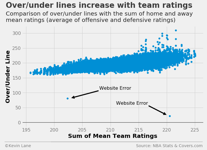
The query below isolates the two incorrect points.
bets = pd.read_sql('''
    SELECT * FROM games
    JOIN betting
    ON games.ID is betting.GAME_ID
    WHERE OVER_UNDER < 100
    ORDER BY GAME_DATE''', conn)
bets = bets.drop(['ID', 'GAME_ID', 'HOME_TEAM_ID', 'AWAY_TEAM_ID'], 1)
print_df(bets.tail())
| SEASON | GAME_DATE | MATCHUP | HOME_WL | OVER_UNDER | OU_RESULT | HOME_SPREAD | HOME_SPREAD_WL |
|---|---|---|---|---|---|---|---|
| 1994 | 1994-11-11 | UTH vs. GOS | L | 22.0 | O | -5.5 | L |
| 2000 | 2001-04-03 | MIA vs. BOS | L | 80.5 | O | -6.0 | L |